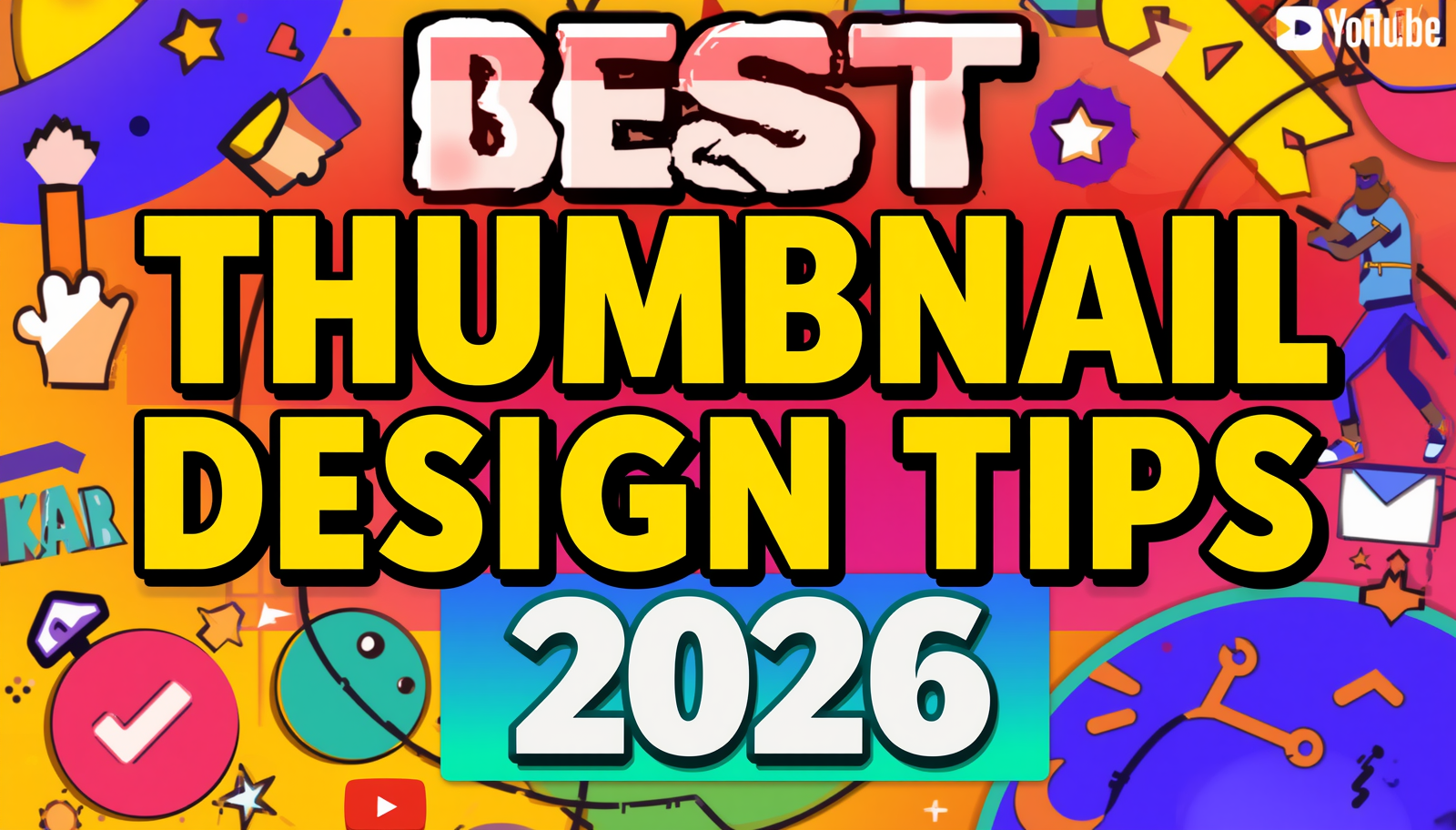
Your YouTube thumbnail is the single most powerful marketing asset for your video. Before a viewer reads your title, before they check your subscriber count, before they decide whether your content is worth their time — they look at your thumbnail. In a feed full of competing videos, you have less than two seconds to catch someone’s attention. This guide covers the best YouTube thumbnail design tips for 2026 that top creators are using to dramatically increase their click-through rates.
Why Thumbnail Design Directly Impacts Your YouTube Growth
A well-designed thumbnail drives the algorithm. YouTube’s recommendation system is heavily influenced by Click-Through Rate (CTR). When more people click your thumbnail relative to how many times it is shown, YouTube reads that as a signal that your content is relevant and engaging. It then shows your video to more people, creating a compounding growth effect.
Even a small improvement in CTR — from 4% to 6% — can double the number of people YouTube recommends your video to. This is why the world’s top YouTubers invest significant time into thumbnail design. It is not vanity — it is strategy.
Tip 1 — Use Bold, High-Contrast Colors
Color is the first thing the human eye processes. In a busy YouTube feed, muted or pastel thumbnails disappear. The thumbnails that consistently get clicked use bold, high-contrast color combinations that pop against YouTube’s white and dark background.
Some of the most effective color combinations include yellow and black, red and white, bright blue and orange, and neon green against dark backgrounds. Always test your thumbnail by shrinking it to thumbnail size on your screen — if it still catches your eye at small scale, it will perform well in the feed.
Tip 2 — Put a Human Face in Your Thumbnail
Multiple studies on YouTube thumbnail performance show that thumbnails featuring a human face with a clear, exaggerated expression perform better than thumbnails without faces. The expression matters as much as the face itself — shock, excitement, confusion, and laughter significantly outperform neutral expressions.
Tip 3 — Keep Text Short and Massive
The best performing thumbnails use 3 to 5 words maximum in a large, bold, easy-to-read font. For fonts, thick sans-serif typefaces like Impact, Bebas Neue, and Montserrat Bold are the most readable at small sizes. Add a strong drop shadow or outline to make your text pop against any background color.
Tip 4 — Use the Rule of Thirds for Layout
Place your main subject at one of the four intersection points of an invisible 3×3 grid. Off-center layouts with a clear visual hierarchy — main subject on one side, bold text on the other — create visual tension that keeps the eye engaged.
Tip 5 — Study and Download Top Thumbnails in Your Niche
One of the most effective ways to improve your thumbnail design is to analyze what is already working. Use ytthumbextractor.com to download thumbnails from any YouTube video in Full HD quality and study font choices, color grading, and composition techniques used by successful creators.
Tip 6 — Create a Consistent Visual Brand
Viewers should recognize your thumbnails in the feed before they even read your channel name. Choose two or three brand colors and stick to them. Use the same one or two fonts consistently. This consistency makes your channel look professional and helps returning viewers instantly recognize your content.
Tip 7 — Design for Mobile First
More than 70% of YouTube views happen on mobile devices. Before finalizing any thumbnail, resize it to approximately 120 x 68 pixels and review it critically. If anything becomes unclear at that size, simplify the design before publishing.
Tip 8 — A/B Test Your Thumbnails
YouTube Studio offers a built-in thumbnail testing feature. Even small changes — a different background color, a different expression — can produce dramatically different results. Read our complete guide on thumbnail testing and A/B strategies to learn exactly how to set this up.
Frequently Asked Questions
Q: What makes a YouTube thumbnail get more clicks? High-contrast colors, a clear human face with an expressive emotion, short bold text, and a clean layout are the most consistent factors that increase thumbnail CTR.
Q: How many words should a YouTube thumbnail have? Ideally 3 to 5 words maximum, large enough to read at thumbnail size.
Q: Should I put my face on every thumbnail? Thumbnails with human faces consistently outperform faceless thumbnails in most niches.
Q: How do I download thumbnails from other YouTube videos to study them? Use ytthumbextractor.com — paste any YouTube video URL and download the thumbnail in Full HD quality for free.
Q: What font is best for YouTube thumbnails? Bold, thick sans-serif fonts work best — Bebas Neue, Impact, Montserrat Bold, and Anton are popular choices.
1 thought on “Best Thumbnail Design Tips 2026 — Get More Clicks”